Build and craft amazing loading experiences that automatically adapts to your Vue app.
This repository is inspired by react-loading-skeleton
Install the package via NPM
npm i @brayamvalero/vue3-skeletonInstall the plugin globally.
import { createApp } from 'vue'
import App from './App.vue'
// Import the component library & Stylesheet
import Skeleton from '@brayamvalero/vue3-skeleton'
import '@brayamvalero/vue3-skeleton/dist/style.css'

createApp(App)
    // Install the Skeleton Plugin
    .use(Skeleton)
    .mount('#app')
Or, install the plugin locally, whether be <script> or <script setup>
<script>
    import { Skeleton } from '@brayamvalero/vue3-skeleton'
    import '@brayamvalero/vue3-skeleton/dist/style.css'

    export default {
        components: { Skeleton },
    }
</script><script setup>
import { Skeleton } from '@brayamvalero/vue3-skeleton'
import '@brayamvalero/vue3-skeleton/dist/style.css'
</script>Now, you're ready to go
<template>
    <div class="Home">
        <h1>
            <!--Skeleton will inherit <h1> height -->
            <Skeleton />
        </h1>
        <p>
            <!--Skeleton will inherit <p> height -->
            <Skeleton :rows="3" />
        </p>
    </div>
</template>Adapting to your defined styles seamlessly, The <Skeleton /> module seamlessly integrates into your components,
filling the void during loading. Unlike other frameworks where crafting a skeleton screen is a meticulous task of
matching font size, line height, and margins, our Skeleton component effortlessly adjusts to the correct dimensions.
Take, for instance:
<template>
    <div class="Home">
        <h1>
            <Skeleton>{{ data.title }}</Skeleton>
        </h1>
        <p>
            <Skeleton :rows="3">{{ data.description }}</Skeleton>
        </p>
    </div>
</template>
This code snippet ensures the generation of precisely proportioned skeletons for both the <h1> and <p> elements
without needing any additional configuration. Moreover, it orchestrates a seamless transition, waiting until the content
is fully loaded before concealing the Skeleton and unveiling the loaded content gracefully.
Instead, craft components equipped with integrated skeleton states.
This methodology offers several advantages:
- Harmonized Styles: Ensures consistency across styles.
- Comprehensive Representation: Components should embody all conceivable states, including loading.
- Enhanced Loading Flexibility: Enables more adaptable loading sequences.
Customize individual skeletons with props, or render a SkeletonTheme to style all skeletons below it.
<script setup>
    import { Skeleton, SkeletonTheme } from '@brayamvalero/vue3-skeleton'
    import '@brayamvalero/vue3-skeleton/dist/style.css'
</script>

<template>
    <div class="Home">
        <!-- This applies Base Color and Highligh Color to all Skeletons -->
        <SkeletonTheme background-color="#303030">
            <h1>
                <Skeleton>{{ data.title }}</Skeleton>
            </h1>
            <p>
                <Skeleton :rows="3">{{ data.description }}</Skeleton>
            </p>
        </SkeletonTheme>
    </div>
</template>
Props declared inside
<Skeleton />will take priority over<SkeletonTheme />props.
Down bellow you can take a look at each prop available.
| Name | Type | Description | Default |
|---|---|---|---|
| rows | number |
Set component amount of rows | 1 |
| circle | boolean |
Set component border-radius to 50%, it replaces borderRadius props |
false |
| containerClass | string |
Set component class to skeleton container | null |
| childClass | string |
Set component class to each skeleton child | null |
| Name | Type | Description | Default |
|---|---|---|---|
| width | string number |
Set component width, it can be either number px or string with its corresponding css value |
100% |
| height | string number |
Set component height, it can be either number px or string with its corresponding css value |
inherit |
| borderRadius | string number |
Set component border-radius, it can be either number px or string with its corresponding css value |
0.25rem |
| backgroundColor | string |
Set component background-color |
#e1e1e1 |
| animationDuration | number |
Set component animation-duration in seconds |
2 |
| enableAnimation | boolean |
Set component animation status running or paused |
true |
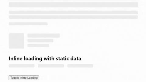
| inline | boolean |
Set component inline behavior | false |
The skeleton width is 0 when the parent has display: flex In the example below, the width of the skeleton will be 0:
<div :style="{ display: 'flex' }">
    <Skeleton :style="{ flex: 1 }" />
</div>
This happens because the skeleton has no intrinsic width. You can fix it by applying flex: 1 to the skeleton
container, you can also set this style via the containerClass prop.