Pure AngularJS component for using dialogs. This service has been tested using Twitter Bootstrap 3.3.5, AngularJS 1.5.5 and Angular-UI-Bootstrap 2.5.0.
-
Install with bower (comming soon),
bower install angular-dialogs --save -
Or download the production version or the development version for JavaScript files, and the production version or the development version for the CSS stylesheets.
In your web page:
<link rel="stylesheet" href="/lib/bootstrap.min.css">
<link rel="stylesheet" href="/lib/angular-dialogs.min.css">

<script type="text/javascript" src="/lib/angular.min.js"></script>
<script type="text/javascript" src="/lib/ui-bootstrap-tpls.min.js"></script>
<script type="text/javascript" src="/lib/angular-dialogs.min.js"></script>

<script type="text/javascript" src="app.js"></script>
And in your app.js:
var app = angular.module('myApp', ['ang-dialogs']);A simple example of the usage would be:
var app = angular.module('myApp', ['ang-dialogs']);
app.controller('myController', function ($dialogs) {
	this.foo = function(){
		$dialogs.showInfoDialog("This is a dialog!", {
			title: "Hello world!",
			closeTimeout: 10
		});
	}
}
You can find a bunch of more complete examples here.
This service includes some predefined dialogs that you can use, however many options are available for customizing your dialogs. As a general rule, for showing a dialog, you should call to the corresponding function (depending on the type of dialog to show). This functions accept two parameters: the message that will be displayed in the body of the dialog, and some options that help you to change the default behaviour (an object, optional).
$dialogs.showTypeOfDialog("My message", {option1:"value1", option2:"value2"})A simple dialog with a message, no colors.
$dialogs.showDefaultDialog("AngularJS rocks!", {title: "Hello"});
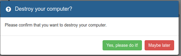
A Yes/No dialog with a message. Many options are available to change the default appearance (e.g. the text for the buttons), and a callback function can be specified which will be executed when the user chooses an option.
$dialogs.showConfirmationDialog("Please confirm", {
	title: "Are you sure?",
	callback: function(option){
			alert("Selected option was '" + option + "'");
	}
});
A simple success message. Again, using options you can change the default appearance and behaviour (e.g. an auto-close countdown).
$dialogs.showSuccessDialog("The process finished successfully.", {
	closeTimeout: 10
});
A dialog showing some useful information.
$dialogs.showInfoDialog("This is an important message.", {
	buttonCloseText : 'OK, I understand.'
});
A wait dialog with an animated loading icon. These dialogs do not show any button by default (but could be added). You can programmatically close them using the closeDialog function (see below).
$dialogs.showWaitDialog("Loading your data...", {
	title: "Your request is being processed.",
	icon: "glyphicon glyphicon-time"
});

//Close the dialog after 10 seconds
setTimeout(function(){
	$dialogs.closeDialog(); //This will close the last opened dialog
}, 3000);
A dialog showing some warning information.
$dialogs.showWarningDialog("It's time to go home"});
A dialog showing error messages. Using the available options you can change the default appearance and behaviour (e.g. adding a "Report" button that could send the error message to the developers).
$dialogs.showErrorDialog("An error occurred. Please send the report.", {
	title: "Damn it, error detected!",
	reportButton: true,
	reportButtonHandler: function(){
		foo();
		alert("Your report has been sent. Thanks!");
	}
});
If none of the previous functions fits to you, you can open a dialog using the following function:
$dialogs.showMessage(message, options);These are the available options that you can use for customizing your dialogs. All options are optional and default values will be used if not present.
-
messageType (string): accepted values are: "default" "info" "confirmation" "success" "warn" "error" and "wait". The type of message. This option is predefined depending on the function that you use for showing the dialog (e.g. if you use showErrorDialog, the type would be error).
-
title (string): the title for the dialog.
-
callback (function): the function that is executed when the dialog is closed. The function is called using the selected option (button) pressed by the user.
 callback: function(option){
   	if(option === "ok"){
   		foo();
   	}else{
   		foo2();
   	}
}-
logMessage (string): a custom message to print at the JavaScript console. Depending on the type of message, the message will be printed using different outputs (error console, log, etc.). By default the log message will be the same message shown in the dialog body.
-
button (boolean): show or hide the buttons (OK, Cancel or Close). Default true for most types of dialogs.
-
reportButton (boolean): show or hide the "Send report" button. Default false.
-
reportButtonHandler (function): the function to be called when pressing the report button.
-
buttonReportText (string): The text shown in the report button.
-
buttonOkText (string): The text shown in the OK button.
-
buttonCancelText (string): The text shown in the Cancel button.
-
buttonCloseText (string): The text shown in the Close button.
-
spin (boolean): display a spinning icon (ideal for waiting dialogs). Default: true for waiting dialogs, false for other types.
-
icon (string): icon showed in the dialog title. Use a Bootstrap valid glyphicon class (e.g. "glyphicon glyphicon-time").
-
closable (boolean): determines if the dialog should be closed when clicking in the backdrop. Default: false.
-
closeTimeout (number): number of seconds to wait until auto-close the dialog. Default: undefined (i.e. disabled).
- Added auto-close for dialogs (countdown)
- New options for customizing the text for buttons.
- Handler for the report button
- Improved examples
- Improved documentation
- Close dialogs -> close most recent dialogs, close by id or close by type
- Added spinning icon for wait dialog
- Wait dialogs and spinning icons
- First public version.
- Supports different types of dialogs: default, confirmation, success, info, warning and error dialogs.
- Supports some configurations: title, message, icon, buttons,...